Config 2024
29 Jun 2024

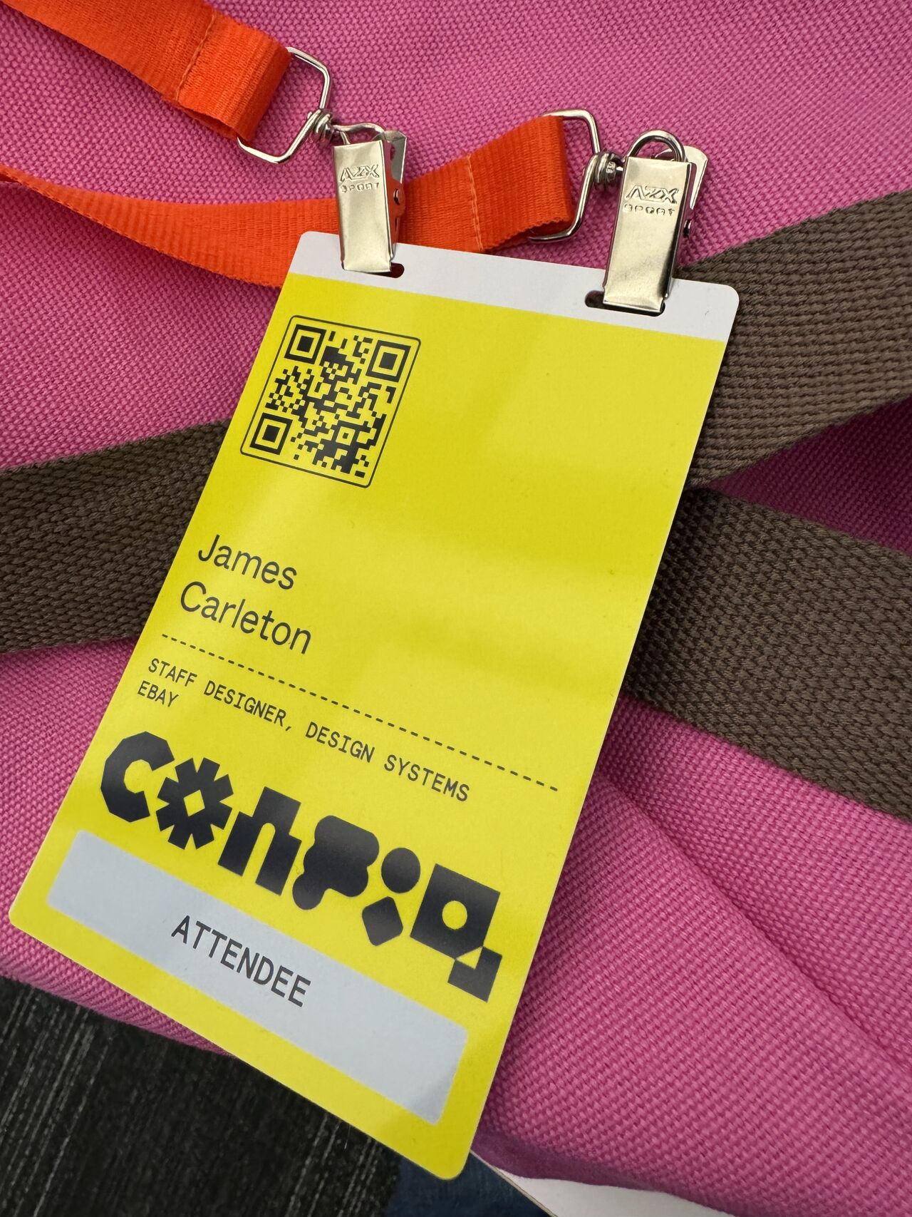
Figma’s Config 2024 was a crazy adventure. Moscone was packed with even more designers (12k?) than last year who were looking to get the scoop on new features, make connections with others, and get inspired by the range of great speakers.
My highlights were meeting my new team in person (hey eBay OX), connecting with several mentees from ADPList in the real world, and catching up with some old friends.
I loved seeing how the conference has evolved since last time. There were more people but my experience finding sessions and food was much smoother this time. The Figma team did a great job with the conference design from branded swag to the details of the exhibition space that was built to foster interaction and exploration.
New features
The news was all about UI3, Figma Slides (aka Flides), and AI everywhere. These product announcements were interesting, but we didn’t get any design systems features this year. I was hoping for better variables management tools, but those will have to wait. One small improvement was moving the component variants and property controls up to the top of the properties panel making them easier to find.
AI was the main character this year, but it will be interesting to see how designers react to these tools which could feel like a threat to our value. Will machines replace us? I don’t have the answers but I expect to see lots more discussion and opinions as the industry figures it out. I like seeing examples where AI can help us work smarter like the ‘Search for similar’ feature that allows for searching through descriptive prompts, images, or a quick sketch.
Figma slides logically improves what designers are already doing, building decks in the tool, by adding extra presentation features. This makes it easy to ditch Powerpoint and Google Slides but it also helps them gain market share by pulling in more product managers as users.
For an expert take on everything new, see Joey Bank’s comprehensive article.

Design on stage
Some of my favorite talks:
- Cam Worboys from CashApp who gave a fresh perspective on how to balance creativity with control in DS. Watch: The broken promises of design systems
- Tregg Frank, previously at Stark now founder at Divinate, brought some great passion for selling accessibility. We know it’s the right thing to do for inclusion, but learn to convince leaders that it’s also good for business. Watch: Pitching accessible design like a pro
- It’s always fun to be inspired from the creative superstar Jesica Hische.
Watch:
LostFound in the details
Learn more from these articles:
- Principles for working with design systems in Figma
- Insights gathered from the design system community
- Figma best practices and features
One more thing…
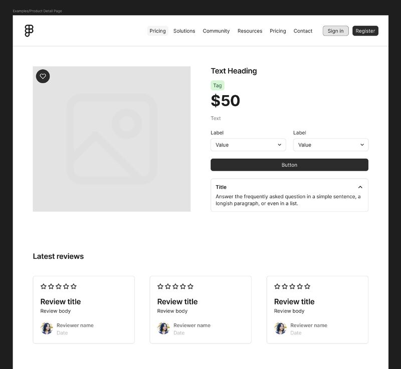
In between all the AI hype, Figma snuck in a great prize. In the community tab browse the new UI Kits section, which includes Material Design and iOS HIG kits for OS reference, but the most interesting one to me was a kit called Simple Design System built by the Figma team.
This UI kit is a powerful resource for students, freelancers and new designers who ask me where to start learning UI and DS skills. You can now easily explore this kit, study how it’s built, and learn from its structure. It’s a great starting point to learning how to create or customize UI kits it for your own projects. For those that code, you can even explore the matching codebase.
