UI Traps - Date Input
03 May 2024
Kill the Date of Birth dropdown!
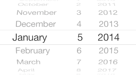
I always cringe when I see a birth date (DOB) input using multiple dropdowns for day/month/year. It’s just lazy design and perpetuates poor experiences. Join my crusade to stop this tragic design crime from living another day (pun intended)! We have so many options for inputs that are far better for sharing dates like these. I bet this mess started in the days when databases required the date to be divided into three separate elements, but we haven’t had that constraint in decades. Why are we still living in the 90s? The application can reformat the input string behind the scenes. Why do we punish our elders who need to scroll back 60, 70, 80 or more years with this annoying input? The older you are the more you have to scroll. Care for your elders, they have enough to worry about.
For very recent dates this might be ok, but any dates further down the list will require a long scroll in each column, making it cumbersome to use.
Side note: The iOS picker wheel UI doesn’t fix this issue, it just masks it with skeuomorphism.
Users first, not system first
What if we thought about this from the user first? Instead of forcing an input format the software prefers, let’s find an input method that best matches the user’s mental model. I like to think of dates in two categories:
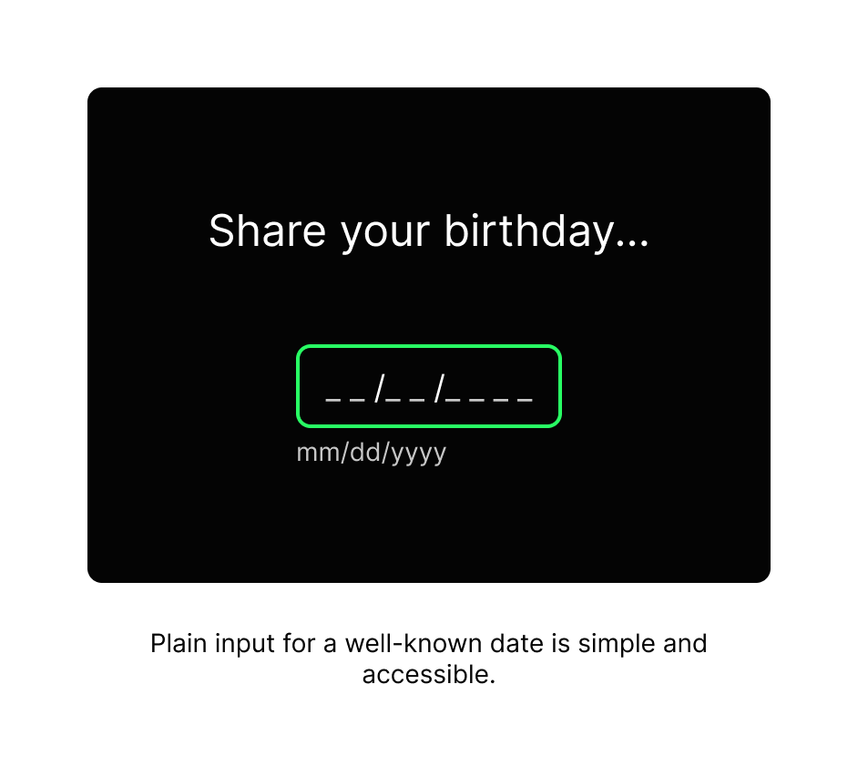
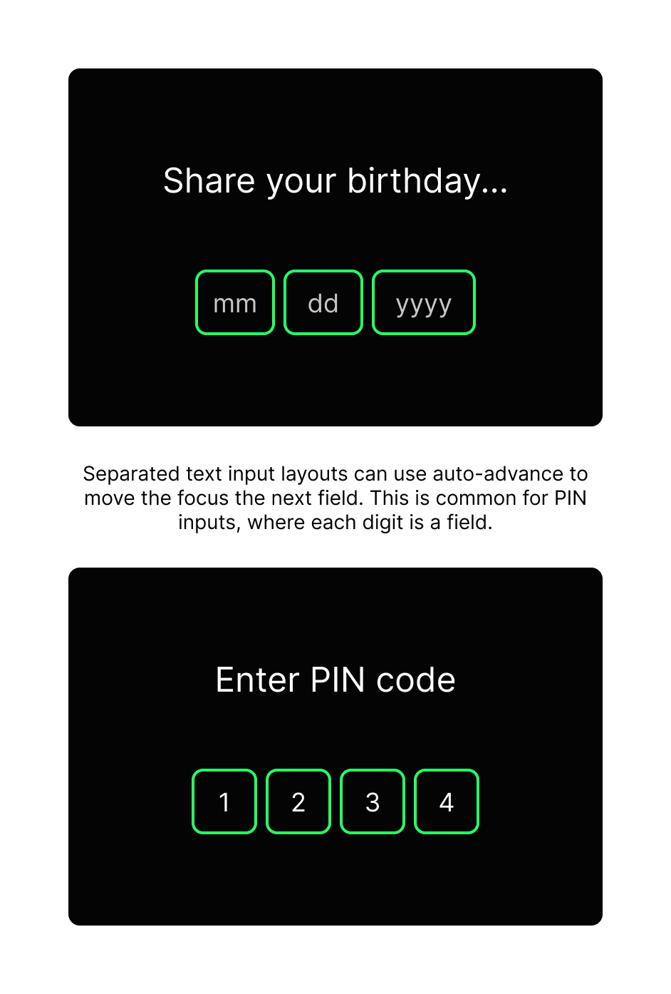
A) Known dates - Type it in
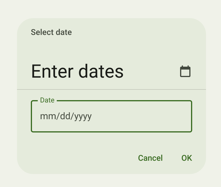
If our product needs a simple, memorized piece of data from the user like a birthday, SSN, PIN, those can easily flow from the user’s brain into a keyboard with little resistance. Simply use a plain text input, which is very easy to understand and complete successfully.
Dates are formatted differently around the world, so make it obvious which order and format your app needs with a placeholder or helper text to show an example, MM/DD/YYYY.
B) Unknown dates - Browse for it
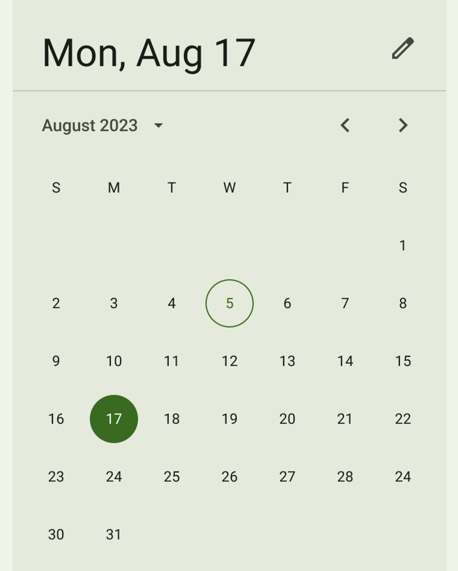
If our product needs a date that benefits from the context of a calendar then a picker view can help show surrounding data and allow a one-click/tap selection. Viewing the month in a traditional calendar helps the user identify a target date quickly. This can be faster than a simple text input when the customer hasn’t memorized the date, like the third Thursday in February but instead needs to browse to find it. Calendar pickers help with cases like payment dates, travel booking, and data reporting ranges.
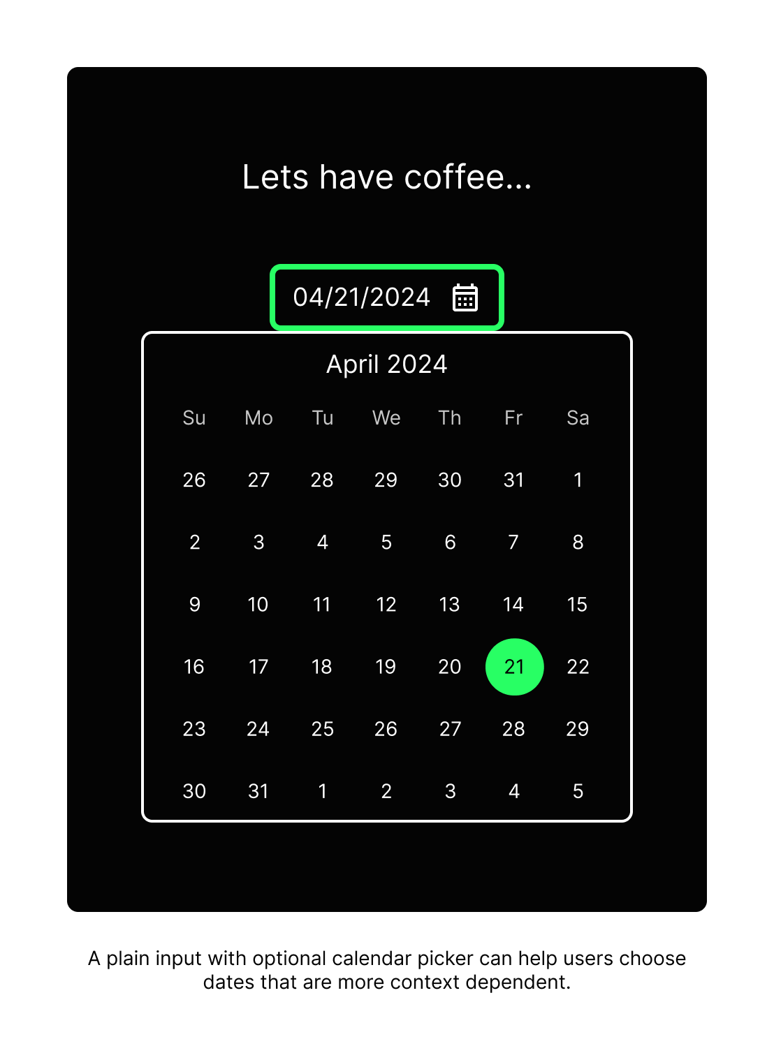
With this direction beware that calendar pickers can quickly become complicated, requiring pagination of months/years, highlighted dates, date ranges, disabled dates, etc. These also require extensive accessibility review for keyboard focus and touch usability. Poorly built examples can trap focus state causing a roadblock for screen readers and assistive tech. Consider native calendar views from iOS and Android which come with internationalization and accessibility built-in.

I suggest including the text input as an alternate input for greater inclusion of the broad array of user preferences. The picker can then be an enhancement to the standard text input providing the extra value of showing context.
There are many more use cases and considerations, so this is the tip of the date input iceberg. Hopefully, I’ve given you a headstart on this UI trap so you can explore the best solution for your product use case. But never forget, kill the dropdowns!
Set a new standard
Together we can improve the industry standards like the dreaded Date of Birth dropdowns. Instead of pointing to big-name competitors’ poor decisions and calling them best practices, think through your designs and look out for manipulative design practices at your company. Just because company X did it, doesn’t mean you should follow. Set yourself as an example of ethical design by avoiding lazy patterns and UI design traps. The customers won’t notice or thank you because good design is often invisible. Do it because we know it’s the right thing to do and it will set an example for others in your company to learn from.